Monday, December 9, 2013

Final Project

 Final Project/Artist Statement

When my project was complete, I was very happy with the final outcome at a digital view. The colors looked vibrant, everything seemed to line up straight, and I found a way to make all three pieces match and bring the whole company together. However, once I printed the final pieces, I noticed my pictures printed blurry, my brochure didn't line up correctly to fold in the proper way, and the business card ended up being too big. I ended up changing my logo last minute, which I ended up being really happy about. Overall this project ended very well and I was impressed with how well I did not knowing how to use InDesign before.


Sunday, November 24, 2013

Brochure Sketch


For the brochure, I decided I wanted to match a light green color scheme on each of the layers. Also, I wanted to incorporate the logo, whether it be the whole logo, just the turtle, or just the text on each page. I feel like this will bring the whole brochure together. I also realized I need to add more detail about my business, so I added a "custom nest" aspect to the business where we customize wine glasses for the perfect gift. The brochure will go into detail with that, also showing images of the apparel we sell and information on the store itself.

Tuesday, November 19, 2013

Letterhead/Business Card Sketches

I posted pictures of 5 sketches each of potential letterheads and business cards for my business. I matched a letter to a business card for all 5 sketches.

Sunday, November 17, 2013

Corporate Identity Questionaire

1)   What is your business?
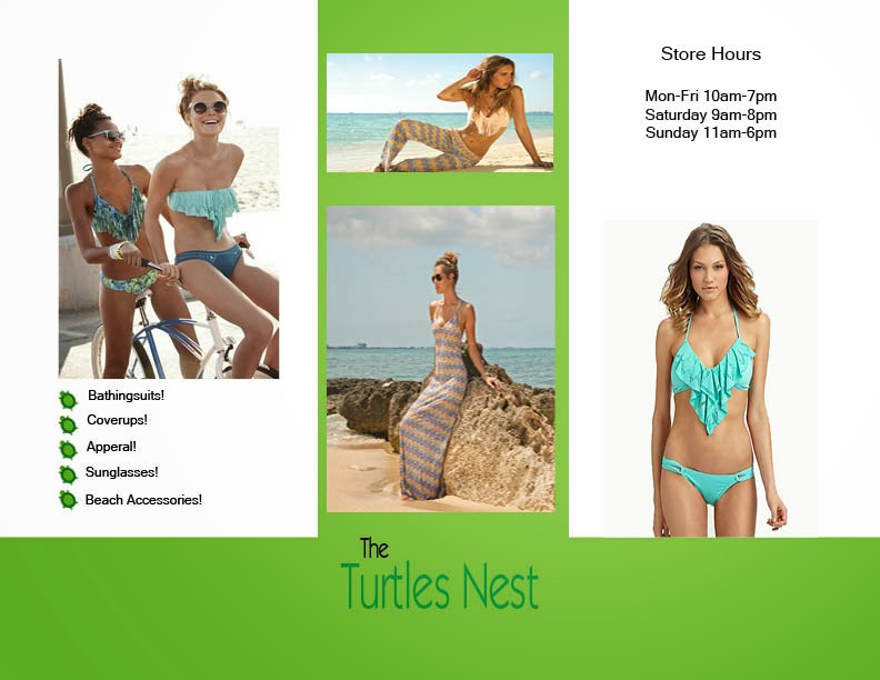
S We sell beach needs including bathingsuits, sandals, beach chairs, etc.
2)   Describe your business in one sentence
We are a small boutique to make shopping for beach goers more convenient.
3)   Who is your target audience?
Local and tourist beach lovers.
4)   Who are your competitors?
The Bungalow, shell store,
5)   What makes them better/worse than your product/service?
tThe Bungalow is a very high end shoppe that is not very affordable for some customers while the shell store is a cheaper store. We have affordable yet high quality products for all types of customers.
6)   Do you currently have an identity?  (This is more for companies that are already established and you’re just revamping the logo/corporate identity.  If you have a new company or product, skip this question.)
NO
7)   (If your answer to #6 is no, skip this question)  What do you like about it and what don’t you like about it?
Why is this important?  Even if you plan to change the logo entirely, it’s good to keep an inventory about what specifically worked and didn’t work about your previous design in order to inform the new one.
These following questions might seem silly, but their purpose is to help generate ideas.
1)   How do you want your image to be seen in two years?
We want our store to be trusted by locals and very tourist friendly. When people ask where to shop on st.pete beach, we want our store to come to find instantly.
2)   If your company was an animal, what animal would it be and why?
A turtle. This was easy to pick based on the name and logo of the store. 
3)   If your company/brand was a person, who would it be and why?
f Steve Jobs because he was a powerful and mastermind behind a strong business.
 
4)   If your company/brand was an object, what would it be?
Adirondack chair with the back shaped into a turtle and the logo on the front. 
5)   If your customer was a cartoon character, who would it be?
A ninja turtle because the mascot is a turtle and the cartoon ninja turtle fights for what is good.

Monday, November 11, 2013

Lyrical Collage

Deciding what setting I wanted to start with for this project was very easy for me. When I was trying to think of a song lyric to create an image around, the Disney theme song "when you wish upon a star" came to mind instantly. Once I had decided what I was going to be working with, I began writing down ideas of different images and characters I wanted to be in the picture. I began with Mickey and Minnie, following the Princesses. These were easy choices for me, and adding some shadow made their placement very realistic. The lyric's were next adding some 3d effects and the wave-like flow of the text to make it feel like a lyric. The star I replaced a few times with different images, and decided to create a brush from a star image off of online. I added the streaks from the star to give it more of a shooting star look. I had a lot of fun working on this project and being creative with what I have learned this far.